
Inverclyde Independent Retailers Growth Programme: Empowering Local Retailers – Press Release
We are thrilled to announce that Lizzy Todd has made history as the youngest female President of the Inverclyde Chamber of Commerce!
We are thrilled to announce that Lizzy Todd has made history as the youngest female President of the Inverclyde Chamber of Commerce!

Newsletters are a valuable tool for businesses and are an effective way to stay in touch with your audience, build relationships, drive traffic, and achieve

We are thrilled to announce that Lizzy Todd has made history as the youngest female President of the Inverclyde Chamber of Commerce!

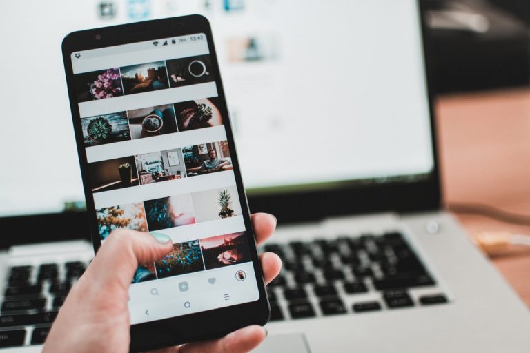
Short form video content has become increasingly popular in recent years, with platforms such as TikTok and Instagram Reels leading the way. Creating short form
